
QStyle
Inherited by: QCommonStyle, QWindowsStyle, QPlastiqueStyle, QCleanlooksStyle, QGtkStyle, QMotifStyle, QCDEStyle
Synopsis
Functions
- def combinedLayoutSpacing (controls1, controls2, orientation[, option=None[, widget=None]])
- def layoutSpacing (control1, control2, orientation[, option=None[, widget=None]])
- def proxy ()
- def setProxy (style)
- def standardIcon (standardIcon[, option=None[, widget=None]])
Virtual functions
- def drawComplexControl (cc, opt, p[, widget=None])
- def drawControl (element, opt, p[, widget=None])
- def drawItemPixmap (painter, rect, alignment, pixmap)
- def drawItemText (painter, rect, flags, pal, enabled, text[, textRole=QPalette.NoRole])
- def drawPrimitive (pe, opt, p[, widget=None])
- def generatedIconPixmap (iconMode, pixmap, opt)
- def hitTestComplexControl (cc, opt, pt[, widget=None])
- def itemPixmapRect (r, flags, pixmap)
- def itemTextRect (fm, r, flags, enabled, text)
- def pixelMetric (metric[, option=None[, widget=None]])
- def polish (arg__1)
- def polish (arg__1)
- def polish (arg__1)
- def sizeFromContents (ct, opt, contentsSize[, w=None])
- def standardPalette ()
- def standardPixmap (standardPixmap[, opt=None[, widget=None]])
- def styleHint (stylehint[, opt=None[, widget=None[, returnData=None]]])
- def subControlRect (cc, opt, sc[, widget=None])
- def subElementRect (subElement, option[, widget=None])
- def unpolish (arg__1)
- def unpolish (arg__1)
Slots
- def layoutSpacingImplementation (control1, control2, orientation[, option=None[, widget=None]])
- def standardIconImplementation (standardIcon[, opt=None[, widget=None]])
Static functions
- def alignedRect (direction, alignment, size, rectangle)
- def sliderPositionFromValue (min, max, val, space[, upsideDown=false])
- def sliderValueFromPosition (min, max, pos, space[, upsideDown=false])
- def visualAlignment (direction, alignment)
- def visualPos (direction, boundingRect, logicalPos)
- def visualRect (direction, boundingRect, logicalRect)
Detailed Description
The PySide.QtGui.QStyle class is an abstract base class that encapsulates the look and feel of a GUI.
Qt contains a set of PySide.QtGui.QStyle subclasses that emulate the styles of the different platforms supported by Qt ( PySide.QtGui.QWindowsStyle , QMacStyle , PySide.QtGui.QMotifStyle , etc.). By default, these styles are built into the QtGui library. Styles can also be made available as plugins.
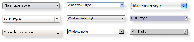
Qt’s built-in widgets use PySide.QtGui.QStyle to perform nearly all of their drawing, ensuring that they look exactly like the equivalent native widgets. The diagram below shows a PySide.QtGui.QComboBox in eight different styles.
Topics:
Setting a Style
The style of the entire application can be set using the QApplication.setStyle() function. It can also be specified by the user of the application, using the -style command-line option:
python myapplication.py -style motifIf no style is specified, Qt will choose the most appropriate style for the user’s platform or desktop environment.
A style can also be set on an individual widget using the QWidget.setStyle() function.
Developing Style-Aware Custom Widgets
If you are developing custom widgets and want them to look good on all platforms, you can use PySide.QtGui.QStyle functions to perform parts of the widget drawing, such as PySide.QtGui.QStyle.drawItemText() , PySide.QtGui.QStyle.drawItemPixmap() , PySide.QtGui.QStyle.drawPrimitive() , PySide.QtGui.QStyle.drawControl() , and PySide.QtGui.QStyle.drawComplexControl() .
Most PySide.QtGui.QStyle draw functions take four arguments:
- an enum value specifying which graphical element to draw
- a PySide.QtGui.QStyleOption specifying how and where to render that element
- a PySide.QtGui.QPainter that should be used to draw the element
- a PySide.QtGui.QWidget on which the drawing is performed (optional)
For example, if you want to draw a focus rectangle on your widget, you can write:
def paintEvent(self, event):


    painter = QPainter(self)


    option = QStyleOptionFocusRect()
    option.initFrom(self)
    option.backgroundColor = palette().color(QPalette.Background)


    style().drawPrimitive(QStyle.PE_FrameFocusRect, option, painter, self)
PySide.QtGui.QStyle gets all the information it needs to render the graphical element from PySide.QtGui.QStyleOption . The widget is passed as the last argument in case the style needs it to perform special effects (such as animated default buttons on Mac OS X), but it isn’t mandatory. In fact, you can use PySide.QtGui.QStyle to draw on any paint device, not just widgets, by setting the PySide.QtGui.QPainter properly.
PySide.QtGui.QStyleOption has various subclasses for the various types of graphical elements that can be drawn. For example, PE_FrameFocusRect expects a PySide.QtGui.QStyleOptionFocusRect argument.
To ensure that drawing operations are as fast as possible, PySide.QtGui.QStyleOption and its subclasses have public data members. See the PySide.QtGui.QStyleOption class documentation for details on how to use it.
For convenience, Qt provides the PySide.QtGui.QStylePainter class, which combines a PySide.QtGui.QStyle , a PySide.QtGui.QPainter , and a PySide.QtGui.QWidget . This makes it possible to write
painter = QStylePainter(self)
...
painter.drawPrimitive(QStyle.PE_FrameFocusRect, option)
instead of
painter = QPainter(self)
...
style().drawPrimitive(QStyle.PE_FrameFocusRect, option, painter, self)
Creating a Custom Style
You can create a custom look and feel for your application by creating a custom style. There are two approaches to creating a custom style. In the static approach, you either choose an existing PySide.QtGui.QStyle class, subclass it, and reimplement virtual functions to provide the custom behavior, or you create an entire PySide.QtGui.QStyle class from scratch. In the dynamic approach, you modify the behavior of your system style at runtime. The static approach is described below. The dynamic approach is described in QProxyStyle .
The first step in the static approach is to pick one of the styles provided by Qt from which you will build your custom style. Your choice of PySide.QtGui.QStyle class will depend on which style resembles your desired style the most. The most general class that you can use as a base is PySide.QtGui.QCommonStyle (not PySide.QtGui.QStyle ). This is because Qt requires its styles to be PySide.QtGui.QCommonStyle s.
Depending on which parts of the base style you want to change, you must reimplement the functions that are used to draw those parts of the interface. To illustrate this, we will modify the look of the spin box arrows drawn by PySide.QtGui.QWindowsStyle . The arrows are primitive elements that are drawn by the PySide.QtGui.QStyle.drawPrimitive() function, so we need to reimplement that function. We need the following class declaration:
class CustomStyle(QWindowsStyle):
    ...

    def drawPrimitive(PrimitiveElement element, const QStyleOption *option,
                      QPainter *painter, const QWidget *widget) const;
        # element : PrimitiveElement
        # option  : QStyleOption
        # painter : QPainter
        # widget  : QWidget
        ...
To draw its up and down arrows, PySide.QtGui.QSpinBox uses the PE_IndicatorSpinUp and PE_IndicatorSpinDown primitive elements. Here’s how to reimplement the PySide.QtGui.QStyle.drawPrimitive() function to draw them differently:
def drawPrimitive(element, option, painter, widget):
    if element == PE_IndicatorSpinUp or element == PE_IndicatorSpinDown:
        points = QPolygon(3)
        x = option->rect.x()
        y = option->rect.y()
        w = option->rect.width() / 2
        h = option->rect.height() / 2
        x += (option->rect.width() - w) / 2
        y += (option->rect.height() - h) / 2

        if element == PE_IndicatorSpinUp:
            points[0] = QPoint(x, y + h)
            points[1] = QPoint(x + w, y + h)
            points[2] = QPoint(x + w / 2, y)
        else: # PE_SpinBoxDown
            points[0] = QPoint(x, y)
            points[1] = QPoint(x + w, y)
            points[2] = QPoint(x + w / 2, y + h)

        if option.state & State_Enabled:
            painter.setPen(option.palette.mid().color())
            painter.setBrush(option.palette.buttonText())
        else:
            painter.setPen(option.palette.buttonText().color())
            painter.setBrush(option.palette.mid())

        painter.drawPolygon(points)

    else:
        QWindowsStyle.drawPrimitive(element, option, painter, widget)

}
Notice that we don’t use the widget argument, except to pass it on to the QWindowStyle::drawPrimitive() function. As mentioned earlier, the information about what is to be drawn and how it should be drawn is specified by a PySide.QtGui.QStyleOption object, so there is no need to ask the widget.
If you need to use the widget argument to obtain additional information, be careful to ensure that it isn’t 0 and that it is of the correct type before using it. For example:
    if widget:
    ...
<Code snippet "doc/src/snippets/customstyle/customstyle.cpp:1" not found>
When implementing a custom style, you cannot assume that the widget is a PySide.QtGui.QSpinBox just because the enum value is called PE_IndicatorSpinUp or PE_IndicatorSpinDown .
The documentation for the Styles example covers this topic in more detail.
Warning
Qt style sheets are currently not supported for custom PySide.QtGui.QStyle subclasses. We plan to address this in some future release.
Using a Custom Style
There are several ways of using a custom style in a Qt application. The simplest way is to pass the custom style to the QApplication.setStyle() static function before creating the PySide.QtGui.QApplication object:
import sys
from PySide.QtGui import *

QApplication.setStyle(CustomStyle())
app = QApplication(sys.argv)
spinBox = QSpinBox()
spinBox.show()
sys.exit(app.exec_())
You can call QApplication.setStyle() at any time, but by calling it before the constructor, you ensure that the user’s preference, set using the -style command-line option, is respected.
You may want to make your custom style available for use in other applications, which may not be yours and hence not available for you to recompile. The Qt Plugin system makes it possible to create styles as plugins. Styles created as plugins are loaded as shared objects at runtime by Qt itself. Please refer to the Qt Plugin documentation for more information on how to go about creating a style plugin.
Compile your plugin and put it into Qt’s plugins/styles directory. We now have a pluggable style that Qt can load automatically. To use your new style with existing applications, simply start the application with the following argument:
python myapplication.py -style customThe application will use the look and feel from the custom style you implemented.
Right-to-Left Desktops
Languages written from right to left (such as Arabic and Hebrew) usually also mirror the whole layout of widgets, and require the light to come from the screen’s top-right corner instead of top-left.
If you create a custom style, you should take special care when drawing asymmetric elements to make sure that they also look correct in a mirrored layout. An easy way to test your styles is to run applications with the -reverse command-line option or to call QApplication.setLayoutDirection() in your main() function.
Here are some things to keep in mind when making a style work well in a right-to-left environment:
- PySide.QtGui.QStyle.subControlRect() and PySide.QtGui.QStyle.subElementRect() return rectangles in screen coordinates
- QStyleOption.direction indicates in which direction the item should be drawn in
- If a style is not right-to-left aware it will display items as if it were left-to-right
- PySide.QtGui.QStyle.visualRect() , PySide.QtGui.QStyle.visualPos() , and PySide.QtGui.QStyle.visualAlignment() are helpful functions that will translate from logical to screen representations.
- PySide.QtGui.QStyle.alignedRect() will return a logical rect aligned for the current direction
Styles in Item Views
The painting of items in views is performed by a delegate. Qt’s default delegate, PySide.QtGui.QStyledItemDelegate , is also used for for calculating bounding rectangles of items, and their sub-elements for the various kind of item data roles PySide.QtGui.QStyledItemDelegate supports. See the PySide.QtGui.QStyledItemDelegate class description to find out which datatypes and roles are supported. You can read more about item data roles in Model/View Programming .
When PySide.QtGui.QStyledItemDelegate paints its items, it draws CE_ItemViewItem , and calculates their size with CT_ItemViewItem . Note also that it uses SE_ItemViewItemText to set the size of editors. When implementing a style to customize drawing of item views, you need to check the implementation of PySide.QtGui.QCommonStyle (and any other subclasses from which your style inherits). This way, you find out which and how other style elements are painted, and you can then reimplement the painting of elements that should be drawn differently.
We include a small example where we customize the drawing of item backgrounds.
switch (element) {
    case (PE_PanelItemViewItem): {
        painter->save();

        QPoint topLeft = option->rect.topLeft();
        QPoint bottomRight = option->rect.topRight();
        QLinearGradient backgroundGradient(topLeft, bottomRight);
        backgroundGradient.setColorAt(0.0, QColor(Qt::yellow).lighter(190));
        backgroundGradient.setColorAt(1.0, Qt::white);
        painter->fillRect(option->rect, QBrush(backgroundGradient));

        painter->restore();
    break;
    }
    default:
        QWindowsStyle::drawPrimitive(element, option, painter, widget);
}
The primitive element PE_PanelItemViewItem is responsible for painting the background of items, and is called from PySide.QtGui.QCommonStyle ‘s implementation of CE_ItemViewItem .
To add support for drawing of new datatypes and item data roles, it is necessary to create a custom delegate. But if you only need to support the datatypes implemented by the default delegate, a custom style does not need an accompanying delegate. The PySide.QtGui.QStyledItemDelegate class description gives more information on custom delegates.
The drawing of item view headers is also done by the style, giving control over size of header items and row and column sizes.
See also
PySide.QtGui.QStyleOption PySide.QtGui.QStylePainter Styles Example Styles and Style Aware Widgets PySide.QtGui.QStyledItemDelegate
- class PySide.QtGui.QStyle
Constructs a style object.
- PySide.QtGui.QStyle.PixelMetric
This enum describes the various available pixel metrics. A pixel metric is a style dependent size represented by a single pixel value.
Constant Description QStyle.PM_ButtonMargin Amount of whitespace between push button labels and the frame. QStyle.PM_DockWidgetTitleBarButtonMargin Amount of whitespace between dock widget’s title bar button labels and the frame. QStyle.PM_ButtonDefaultIndicator Width of the default-button indicator frame. QStyle.PM_MenuButtonIndicator Width of the menu button indicator proportional to the widget height. QStyle.PM_ButtonShiftHorizontal Horizontal contents shift of a button when the button is down. QStyle.PM_ButtonShiftVertical Vertical contents shift of a button when the button is down. QStyle.PM_DefaultFrameWidth Default frame width (usually 2). QStyle.PM_SpinBoxFrameWidth Frame width of a spin box, defaults to PM_DefaultFrameWidth . QStyle.PM_ComboBoxFrameWidth Frame width of a combo box, defaults to PM_DefaultFrameWidth . QStyle.PM_MDIFrameWidth Obsolete. Use PM_MdiSubWindowFrameWidth instead. QStyle.PM_MdiSubWindowFrameWidth Frame width of an MDI window. QStyle.PM_MDIMinimizedWidth Obsolete. Use PM_MdiSubWindowMinimizedWidth instead. QStyle.PM_MdiSubWindowMinimizedWidth Width of a minimized MDI window. QStyle.PM_LayoutLeftMargin Default left margin for a PySide.QtGui.QLayout . QStyle.PM_LayoutTopMargin Default top margin for a PySide.QtGui.QLayout . QStyle.PM_LayoutRightMargin Default right margin for a PySide.QtGui.QLayout . QStyle.PM_LayoutBottomMargin Default bottom margin for a PySide.QtGui.QLayout . QStyle.PM_LayoutHorizontalSpacing Default horizontal spacing for a PySide.QtGui.QLayout . QStyle.PM_LayoutVerticalSpacing Default vertical spacing for a PySide.QtGui.QLayout . QStyle.PM_MaximumDragDistance The maximum allowed distance between the mouse and a scrollbar when dragging. Exceeding the specified distance will cause the slider to jump back to the original position; a value of -1 disables this behavior. QStyle.PM_ScrollBarExtent Width of a vertical scroll bar and the height of a horizontal scroll bar. QStyle.PM_ScrollBarSliderMin The minimum height of a vertical scroll bar’s slider and the minimum width of a horizontal scroll bar’s slider. QStyle.PM_SliderThickness Total slider thickness. QStyle.PM_SliderControlThickness Thickness of the slider handle. QStyle.PM_SliderLength Length of the slider. QStyle.PM_SliderTickmarkOffset The offset between the tickmarks and the slider. QStyle.PM_SliderSpaceAvailable The available space for the slider to move. QStyle.PM_DockWidgetSeparatorExtent Width of a separator in a horizontal dock window and the height of a separator in a vertical dock window. QStyle.PM_DockWidgetHandleExtent Width of the handle in a horizontal dock window and the height of the handle in a vertical dock window. QStyle.PM_DockWidgetFrameWidth Frame width of a dock window. QStyle.PM_DockWidgetTitleMargin Margin of the dock window title. QStyle.PM_MenuBarPanelWidth Frame width of a menu bar, defaults to PM_DefaultFrameWidth . QStyle.PM_MenuBarItemSpacing Spacing between menu bar items. QStyle.PM_MenuBarHMargin Spacing between menu bar items and left/right of bar. QStyle.PM_MenuBarVMargin Spacing between menu bar items and top/bottom of bar. QStyle.PM_ToolBarFrameWidth Width of the frame around toolbars. QStyle.PM_ToolBarHandleExtent Width of a toolbar handle in a horizontal toolbar and the height of the handle in a vertical toolbar. QStyle.PM_ToolBarItemMargin Spacing between the toolbar frame and the items. QStyle.PM_ToolBarItemSpacing Spacing between toolbar items. QStyle.PM_ToolBarSeparatorExtent Width of a toolbar separator in a horizontal toolbar and the height of a separator in a vertical toolbar. QStyle.PM_ToolBarExtensionExtent Width of a toolbar extension button in a horizontal toolbar and the height of the button in a vertical toolbar. QStyle.PM_TabBarTabOverlap Number of pixels the tabs should overlap. (Currently only used in styles, not inside of PySide.QtGui.QTabBar ) QStyle.PM_TabBarTabHSpace Extra space added to the tab width. QStyle.PM_TabBarTabVSpace Extra space added to the tab height. QStyle.PM_TabBarBaseHeight Height of the area between the tab bar and the tab pages. QStyle.PM_TabBarBaseOverlap Number of pixels the tab bar overlaps the tab bar base. QStyle.PM_TabBarScrollButtonWidth QStyle.PM_TabBarTabShiftHorizontal Horizontal pixel shift when a tab is selected. QStyle.PM_TabBarTabShiftVertical Vertical pixel shift when a tab is selected. QStyle.PM_ProgressBarChunkWidth Width of a chunk in a progress bar indicator. QStyle.PM_SplitterWidth Width of a splitter. QStyle.PM_TitleBarHeight Height of the title bar. QStyle.PM_IndicatorWidth Width of a check box indicator. QStyle.PM_IndicatorHeight Height of a checkbox indicator. QStyle.PM_ExclusiveIndicatorWidth Width of a radio button indicator. QStyle.PM_ExclusiveIndicatorHeight Height of a radio button indicator. QStyle.PM_MenuPanelWidth Border width (applied on all sides) for a PySide.QtGui.QMenu . QStyle.PM_MenuHMargin Additional border (used on left and right) for a PySide.QtGui.QMenu . QStyle.PM_MenuVMargin Additional border (used for bottom and top) for a PySide.QtGui.QMenu . QStyle.PM_MenuScrollerHeight Height of the scroller area in a PySide.QtGui.QMenu . QStyle.PM_MenuTearoffHeight Height of a tear off area in a PySide.QtGui.QMenu . QStyle.PM_MenuDesktopFrameWidth The frame width for the menu on the desktop. QStyle.PM_CheckListButtonSize Area (width/height) of the checkbox/radio button in a Q3CheckListItem . QStyle.PM_CheckListControllerSize Area (width/height) of the controller in a Q3CheckListItem . QStyle.PM_HeaderMarkSize The size of the sort indicator in a header. QStyle.PM_HeaderGripMargin The size of the resize grip in a header. QStyle.PM_HeaderMargin The size of the margin between the sort indicator and the text. QStyle.PM_SpinBoxSliderHeight The height of the optional spin box slider. QStyle.PM_ToolBarIconSize Default tool bar icon size QStyle.PM_SmallIconSize Default small icon size QStyle.PM_LargeIconSize Default large icon size QStyle.PM_FocusFrameHMargin Horizontal margin that the focus frame will outset the widget by. QStyle.PM_FocusFrameVMargin Vertical margin that the focus frame will outset the widget by. QStyle.PM_IconViewIconSize The default size for icons in an icon view. QStyle.PM_ListViewIconSize The default size for icons in a list view. QStyle.PM_ToolTipLabelFrameWidth The frame width for a tool tip label. QStyle.PM_CheckBoxLabelSpacing The spacing between a check box indicator and its label. QStyle.PM_RadioButtonLabelSpacing The spacing between a radio button indicator and its label. QStyle.PM_TabBarIconSize The default icon size for a tab bar. QStyle.PM_SizeGripSize The size of a size grip. QStyle.PM_MessageBoxIconSize The size of the standard icons in a message box QStyle.PM_ButtonIconSize The default size of button icons QStyle.PM_TextCursorWidth The width of the cursor in a line edit or text edit QStyle.PM_TabBar_ScrollButtonOverlap The distance between the left and right buttons in a tab bar. QStyle.PM_TabCloseIndicatorWidth The default width of a close button on a tab in a tab bar. QStyle.PM_TabCloseIndicatorHeight The default height of a close button on a tab in a tab bar. QStyle.PM_CustomBase Base value for custom pixel metrics. Custom values must be greater than this value. The following values are obsolete:
Constant Description QStyle.PM_DefaultTopLevelMargin Use PM_LayoutLeftMargin , PM_LayoutTopMargin , PM_LayoutRightMargin , and PM_LayoutBottomMargin instead. QStyle.PM_DefaultChildMargin Use PM_LayoutLeftMargin , PM_LayoutTopMargin , PM_LayoutRightMargin , and PM_LayoutBottomMargin instead. QStyle.PM_DefaultLayoutSpacing Use PM_LayoutHorizontalSpacing and PM_LayoutVerticalSpacing instead. QStyle.PM_ScrollView_ScrollBarSpacing Distance between frame and scrollbar with SH_ScrollView_FrameOnlyAroundContents set. QStyle.PM_SubMenuOverlap The horizontal overlap between a submenu and its parent. See also
- PySide.QtGui.QStyle.SubControl
This enum describes the available sub controls. A subcontrol is a control element within a complex control ( QStyle.ComplexControl ).
Constant Description QStyle.SC_None Special value that matches no other sub control. QStyle.SC_ScrollBarAddLine Scroll bar add line (i.e., down/right arrow); see also PySide.QtGui.QScrollBar . QStyle.SC_ScrollBarSubLine Scroll bar sub line (i.e., up/left arrow). QStyle.SC_ScrollBarAddPage Scroll bar add page (i.e., page down). QStyle.SC_ScrollBarSubPage Scroll bar sub page (i.e., page up). QStyle.SC_ScrollBarFirst Scroll bar first line (i.e., home). QStyle.SC_ScrollBarLast Scroll bar last line (i.e., end). QStyle.SC_ScrollBarSlider Scroll bar slider handle. QStyle.SC_ScrollBarGroove Special sub-control which contains the area in which the slider handle may move. QStyle.SC_SpinBoxUp Spin widget up/increase; see also PySide.QtGui.QSpinBox . QStyle.SC_SpinBoxDown Spin widget down/decrease. QStyle.SC_SpinBoxFrame Spin widget frame. QStyle.SC_SpinBoxEditField Spin widget edit field. QStyle.SC_ComboBoxEditField Combobox edit field; see also PySide.QtGui.QComboBox . QStyle.SC_ComboBoxArrow Combobox arrow button. QStyle.SC_ComboBoxFrame Combobox frame. QStyle.SC_ComboBoxListBoxPopup The reference rectangle for the combobox popup. Used to calculate the position of the popup. QStyle.SC_SliderGroove Special sub-control which contains the area in which the slider handle may move. QStyle.SC_SliderHandle Slider handle. QStyle.SC_SliderTickmarks Slider tickmarks. QStyle.SC_ToolButton Tool button (see also PySide.QtGui.QToolButton ). QStyle.SC_ToolButtonMenu Sub-control for opening a popup menu in a tool button; see also Q3PopupMenu . QStyle.SC_TitleBarSysMenu System menu button (i.e., restore, close, etc.). QStyle.SC_TitleBarMinButton Minimize button. QStyle.SC_TitleBarMaxButton Maximize button. QStyle.SC_TitleBarCloseButton Close button. QStyle.SC_TitleBarLabel Window title label. QStyle.SC_TitleBarNormalButton Normal (restore) button. QStyle.SC_TitleBarShadeButton Shade button. QStyle.SC_TitleBarUnshadeButton Unshade button. QStyle.SC_TitleBarContextHelpButton Context Help button. QStyle.SC_Q3ListView The list view area. QStyle.SC_Q3ListViewExpand Expand item (i.e., show/hide child items). QStyle.SC_DialHandle The handle of the dial (i.e. what you use to control the dial). QStyle.SC_DialGroove The groove for the dial. QStyle.SC_DialTickmarks The tickmarks for the dial. QStyle.SC_GroupBoxFrame The frame of a group box. QStyle.SC_GroupBoxLabel The title of a group box. QStyle.SC_GroupBoxCheckBox The optional check box of a group box. QStyle.SC_GroupBoxContents The group box contents. QStyle.SC_MdiNormalButton The normal button for a MDI subwindow in the menu bar. QStyle.SC_MdiMinButton The minimize button for a MDI subwindow in the menu bar. QStyle.SC_MdiCloseButton The close button for a MDI subwindow in the menu bar. QStyle.SC_All Special value that matches all sub-controls. See also
QStyle.ComplexControl
- PySide.QtGui.QStyle.StandardPixmap
This enum describes the available standard pixmaps. A standard pixmap is a pixmap that can follow some existing GUI style or guideline.
Constant Description QStyle.SP_TitleBarMinButton Minimize button on title bars (e.g., in PySide.QtGui.QMdiSubWindow ). QStyle.SP_TitleBarMenuButton Menu button on a title bar. QStyle.SP_TitleBarMaxButton Maximize button on title bars. QStyle.SP_TitleBarCloseButton Close button on title bars. QStyle.SP_TitleBarNormalButton Normal (restore) button on title bars. QStyle.SP_TitleBarShadeButton Shade button on title bars. QStyle.SP_TitleBarUnshadeButton Unshade button on title bars. QStyle.SP_TitleBarContextHelpButton The Context help button on title bars. QStyle.SP_MessageBoxInformation The “information” icon. QStyle.SP_MessageBoxWarning The “warning” icon. QStyle.SP_MessageBoxCritical The “critical” icon. QStyle.SP_MessageBoxQuestion The “question” icon. QStyle.SP_DesktopIcon The “desktop” icon. QStyle.SP_TrashIcon The “trash” icon. QStyle.SP_ComputerIcon The “My computer” icon. QStyle.SP_DriveFDIcon The floppy icon. QStyle.SP_DriveHDIcon The harddrive icon. QStyle.SP_DriveCDIcon The CD icon. QStyle.SP_DriveDVDIcon The DVD icon. QStyle.SP_DriveNetIcon The network icon. QStyle.SP_DirHomeIcon The home directory icon. QStyle.SP_DirOpenIcon The open directory icon. QStyle.SP_DirClosedIcon The closed directory icon. QStyle.SP_DirIcon The directory icon. QStyle.SP_DirLinkIcon The link to directory icon. QStyle.SP_FileIcon The file icon. QStyle.SP_FileLinkIcon The link to file icon. QStyle.SP_FileDialogStart The “start” icon in a file dialog. QStyle.SP_FileDialogEnd The “end” icon in a file dialog. QStyle.SP_FileDialogToParent The “parent directory” icon in a file dialog. QStyle.SP_FileDialogNewFolder The “create new folder” icon in a file dialog. QStyle.SP_FileDialogDetailedView The detailed view icon in a file dialog. QStyle.SP_FileDialogInfoView The file info icon in a file dialog. QStyle.SP_FileDialogContentsView The contents view icon in a file dialog. QStyle.SP_FileDialogListView The list view icon in a file dialog. QStyle.SP_FileDialogBack The back arrow in a file dialog. QStyle.SP_DockWidgetCloseButton Close button on dock windows (see also PySide.QtGui.QDockWidget ). QStyle.SP_ToolBarHorizontalExtensionButton Extension button for horizontal toolbars. QStyle.SP_ToolBarVerticalExtensionButton Extension button for vertical toolbars. QStyle.SP_DialogOkButton Icon for a standard OK button in a PySide.QtGui.QDialogButtonBox . QStyle.SP_DialogCancelButton Icon for a standard Cancel button in a PySide.QtGui.QDialogButtonBox . QStyle.SP_DialogHelpButton Icon for a standard Help button in a PySide.QtGui.QDialogButtonBox . QStyle.SP_DialogOpenButton Icon for a standard Open button in a PySide.QtGui.QDialogButtonBox . QStyle.SP_DialogSaveButton Icon for a standard Save button in a PySide.QtGui.QDialogButtonBox . QStyle.SP_DialogCloseButton Icon for a standard Close button in a PySide.QtGui.QDialogButtonBox . QStyle.SP_DialogApplyButton Icon for a standard Apply button in a PySide.QtGui.QDialogButtonBox . QStyle.SP_DialogResetButton Icon for a standard Reset button in a PySide.QtGui.QDialogButtonBox . QStyle.SP_DialogDiscardButton Icon for a standard Discard button in a PySide.QtGui.QDialogButtonBox . QStyle.SP_DialogYesButton Icon for a standard Yes button in a PySide.QtGui.QDialogButtonBox . QStyle.SP_DialogNoButton Icon for a standard No button in a PySide.QtGui.QDialogButtonBox . QStyle.SP_ArrowUp Icon arrow pointing up. QStyle.SP_ArrowDown Icon arrow pointing down. QStyle.SP_ArrowLeft Icon arrow pointing left. QStyle.SP_ArrowRight Icon arrow pointing right. QStyle.SP_ArrowBack Equivalent to SP_ArrowLeft when the current layout direction is Qt.LeftToRight , otherwise SP_ArrowRight . QStyle.SP_ArrowForward Equivalent to SP_ArrowRight when the current layout direction is Qt.LeftToRight , otherwise SP_ArrowLeft . QStyle.SP_CommandLink Icon used to indicate a Vista style command link glyph. QStyle.SP_VistaShield Icon used to indicate UAC prompts on Windows Vista. This will return a null pixmap or icon on all other platforms. QStyle.SP_BrowserReload Icon indicating that the current page should be reloaded. QStyle.SP_BrowserStop Icon indicating that the page loading should stop. QStyle.SP_MediaPlay Icon indicating that media should begin playback. QStyle.SP_MediaStop Icon indicating that media should stop playback. QStyle.SP_MediaPause Icon indicating that media should pause playback. QStyle.SP_MediaSkipForward Icon indicating that media should skip forward. QStyle.SP_MediaSkipBackward Icon indicating that media should skip backward. QStyle.SP_MediaSeekForward Icon indicating that media should seek forward. QStyle.SP_MediaSeekBackward Icon indicating that media should seek backward. QStyle.SP_MediaVolume Icon indicating a volume control. QStyle.SP_MediaVolumeMuted Icon indicating a muted volume control. QStyle.SP_CustomBase Base value for custom standard pixmaps; custom values must be greater than this value. See also
- PySide.QtGui.QStyle.StyleHint
This enum describes the available style hints. A style hint is a general look and/or feel hint.
Constant Description QStyle.SH_EtchDisabledText Disabled text is “etched” as it is on Windows. QStyle.SH_DitherDisabledText Disabled text is dithered as it is on Motif. QStyle.SH_GUIStyle The GUI style to use. QStyle.SH_ScrollBar_ContextMenu Whether or not a scroll bar has a context menu. QStyle.SH_ScrollBar_MiddleClickAbsolutePosition A boolean value. If true, middle clicking on a scroll bar causes the slider to jump to that position. If false, middle clicking is ignored. QStyle.SH_ScrollBar_LeftClickAbsolutePosition A boolean value. If true, left clicking on a scroll bar causes the slider to jump to that position. If false, left clicking will behave as appropriate for each control. QStyle.SH_ScrollBar_ScrollWhenPointerLeavesControl A boolean value. If true, when clicking a scroll bar QStyle.SubControl , holding the mouse button down and moving the pointer outside the QStyle.SubControl , the scroll bar continues to scroll. If false, the scollbar stops scrolling when the pointer leaves the QStyle.SubControl . QStyle.SH_ScrollBar_RollBetweenButtons A boolean value. If true, when clicking a scroll bar button ( SC_ScrollBarAddLine or SC_ScrollBarSubLine ) and dragging over to the opposite button (rolling) will press the new button and release the old one. When it is false, the original button is released and nothing happens (like a push button). QStyle.SH_TabBar_Alignment The alignment for tabs in a PySide.QtGui.QTabWidget . Possible values are Qt.AlignLeft , Qt.AlignCenter and Qt.AlignRight . QStyle.SH_Header_ArrowAlignment The placement of the sorting indicator may appear in list or table headers. Possible values are Qt.Left or Qt.Right . QStyle.SH_Slider_SnapToValue Sliders snap to values while moving, as they do on Windows. QStyle.SH_Slider_SloppyKeyEvents Key presses handled in a sloppy manner, i.e., left on a vertical slider subtracts a line. QStyle.SH_ProgressDialog_CenterCancelButton Center button on progress dialogs, like Motif, otherwise right aligned. QStyle.SH_ProgressDialog_TextLabelAlignment The alignment for text labels in progress dialogs; Qt.AlignCenter on Windows, Qt.AlignVCenter otherwise. QStyle.SH_PrintDialog_RightAlignButtons Right align buttons in the print dialog, as done on Windows. QStyle.SH_MainWindow_SpaceBelowMenuBar One or two pixel space between the menu bar and the dockarea, as done on Windows. QStyle.SH_FontDialog_SelectAssociatedText Select the text in the line edit, or when selecting an item from the listbox, or when the line edit receives focus, as done on Windows. QStyle.SH_Menu_KeyboardSearch Typing causes a menu to be search for relevant items, otherwise only mnemnonic is considered. QStyle.SH_Menu_AllowActiveAndDisabled Allows disabled menu items to be active. QStyle.SH_Menu_SpaceActivatesItem Pressing the space bar activates the item, as done on Motif. QStyle.SH_Menu_SubMenuPopupDelay The number of milliseconds to wait before opening a submenu (256 on Windows, 96 on Motif). QStyle.SH_Menu_Scrollable Whether popup menus must support scrolling. QStyle.SH_Menu_SloppySubMenus Whether popupmenu’s must support sloppy submenu; as implemented on Mac OS. QStyle.SH_ScrollView_FrameOnlyAroundContents Whether scrollviews draw their frame only around contents (like Motif), or around contents, scroll bars and corner widgets (like Windows). QStyle.SH_MenuBar_AltKeyNavigation Menu bars items are navigable by pressing Alt, followed by using the arrow keys to select the desired item. QStyle.SH_ComboBox_ListMouseTracking Mouse tracking in combobox drop-down lists. QStyle.SH_Menu_MouseTracking Mouse tracking in popup menus. QStyle.SH_MenuBar_MouseTracking Mouse tracking in menu bars. QStyle.SH_Menu_FillScreenWithScroll Whether scrolling popups should fill the screen as they are scrolled. QStyle.SH_Menu_SelectionWrap Whether popups should allow the selections to wrap, that is when selection should the next item be the first item. QStyle.SH_ItemView_ChangeHighlightOnFocus Gray out selected items when losing focus. QStyle.SH_Widget_ShareActivation Turn on sharing activation with floating modeless dialogs. QStyle.SH_TabBar_SelectMouseType Which type of mouse event should cause a tab to be selected. QStyle.SH_Q3ListViewExpand_SelectMouseType Which type of mouse event should cause a list view expansion to be selected. QStyle.SH_TabBar_PreferNoArrows Whether a tab bar should suggest a size to prevent scoll arrows. QStyle.SH_ComboBox_Popup Allows popups as a combobox drop-down menu. QStyle.SH_Workspace_FillSpaceOnMaximize The workspace should maximize the client area. QStyle.SH_TitleBar_NoBorder The title bar has no border. QStyle.SH_ScrollBar_StopMouseOverSlider Obsolete. Use SH_Slider_StopMouseOverSlider instead. QStyle.SH_Slider_StopMouseOverSlider Stops auto-repeat when the slider reaches the mouse position. QStyle.SH_BlinkCursorWhenTextSelected Whether cursor should blink when text is selected. QStyle.SH_RichText_FullWidthSelection Whether richtext selections should extend to the full width of the document. QStyle.SH_GroupBox_TextLabelVerticalAlignment How to vertically align a group box’s text label. QStyle.SH_GroupBox_TextLabelColor How to paint a group box’s text label. QStyle.SH_DialogButtons_DefaultButton Which button gets the default status in a dialog’s button widget. QStyle.SH_ToolBox_SelectedPageTitleBold Boldness of the selected page title in a PySide.QtGui.QToolBox . QStyle.SH_LineEdit_PasswordCharacter The Unicode character to be used for passwords. QStyle.SH_Table_GridLineColor The RGB value of the grid for a table. QStyle.SH_UnderlineShortcut Whether shortcuts are underlined. QStyle.SH_SpellCheckUnderlineStyle A QTextCharFormat.UnderlineStyle value that specifies the way misspelled words should be underlined. QStyle.SH_SpinBox_AnimateButton Animate a click when up or down is pressed in a spin box. QStyle.SH_SpinBox_KeyPressAutoRepeatRate Auto-repeat interval for spinbox key presses. QStyle.SH_SpinBox_ClickAutoRepeatRate Auto-repeat interval for spinbox mouse clicks. QStyle.SH_SpinBox_ClickAutoRepeatThreshold Auto-repeat threshold for spinbox mouse clicks. QStyle.SH_ToolTipLabel_Opacity An integer indicating the opacity for the tip label, 0 is completely transparent, 255 is completely opaque. QStyle.SH_DrawMenuBarSeparator Indicates whether or not the menu bar draws separators. QStyle.SH_TitleBar_ModifyNotification Indicates if the title bar should show a ‘*’ for windows that are modified. QStyle.SH_Button_FocusPolicy The default focus policy for buttons. QStyle.SH_CustomBase Base value for custom style hints. Custom values must be greater than this value. QStyle.SH_MenuBar_DismissOnSecondClick A boolean indicating if a menu in the menu bar should be dismissed when it is clicked on a second time. (Example: Clicking and releasing on the File Menu in a menu bar and then immediately clicking on the File Menu again.) QStyle.SH_MessageBox_UseBorderForButtonSpacing A boolean indicating what the to use the border of the buttons (computed as half the button height) for the spacing of the button in a message box. QStyle.SH_MessageBox_CenterButtons A boolean indicating whether the buttons in the message box should be centered or not (see QDialogButtonBox::setCentered()). QStyle.SH_MessageBox_TextInteractionFlags A boolean indicating if the text in a message box should allow user interfactions (e.g. selection) or not. QStyle.SH_TitleBar_AutoRaise A boolean indicating whether controls on a title bar ought to update when the mouse is over them. QStyle.SH_ToolButton_PopupDelay An int indicating the popup delay in milliseconds for menus attached to tool buttons. QStyle.SH_FocusFrame_Mask The mask of the focus frame. QStyle.SH_RubberBand_Mask The mask of the rubber band. QStyle.SH_WindowFrame_Mask The mask of the window frame. QStyle.SH_SpinControls_DisableOnBounds Determines if the spin controls will shown as disabled when reaching the spin range boundary. QStyle.SH_Dial_BackgroundRole Defines the style’s preferred background role (as QPalette.ColorRole ) for a dial widget. QStyle.SH_ScrollBar_BackgroundMode The background mode for a scroll bar. QStyle.SH_ComboBox_LayoutDirection The layout direction for the combo box. By default it should be the same as indicated by the QStyleOption.direction variable. QStyle.SH_ItemView_EllipsisLocation The location where ellipses should be added for item text that is too long to fit in an view item. QStyle.SH_ItemView_ShowDecorationSelected When an item in an item view is selected, also highlight the branch or other decoration. QStyle.SH_ItemView_ActivateItemOnSingleClick Emit the activated signal when the user single clicks on an item in an item in an item view. Otherwise the signal is emitted when the user double clicks on an item. QStyle.SH_Slider_AbsoluteSetButtons Which mouse buttons cause a slider to set the value to the position clicked on. QStyle.SH_Slider_PageSetButtons Which mouse buttons cause a slider to page step the value. QStyle.SH_TabBar_ElideMode The default eliding style for a tab bar. QStyle.SH_DialogButtonLayout Controls how buttons are laid out in a PySide.QtGui.QDialogButtonBox , returns a QDialogButtonBox.ButtonLayout enum. QStyle.SH_WizardStyle Controls the look and feel of a PySide.QtGui.QWizard . Returns a QWizard.WizardStyle enum. QStyle.SH_FormLayoutWrapPolicy Provides a default for how rows are wrapped in a PySide.QtGui.QFormLayout . Returns a QFormLayout.RowWrapPolicy enum. QStyle.SH_FormLayoutFieldGrowthPolicy Provides a default for how fields can grow in a PySide.QtGui.QFormLayout . Returns a QFormLayout.FieldGrowthPolicy enum. QStyle.SH_FormLayoutFormAlignment Provides a default for how a PySide.QtGui.QFormLayout aligns its contents within the available space. Returns a Qt.Alignment enum. QStyle.SH_FormLayoutLabelAlignment Provides a default for how a PySide.QtGui.QFormLayout aligns labels within the available space. Returns a Qt.Alignment enum. QStyle.SH_ItemView_ArrowKeysNavigateIntoChildren Controls whether the tree view will select the first child when it is exapanded and the right arrow key is pressed. QStyle.SH_ComboBox_PopupFrameStyle The frame style used when drawing a combobox popup menu. QStyle.SH_DialogButtonBox_ButtonsHaveIcons Indicates whether or not StandardButtons in PySide.QtGui.QDialogButtonBox should have icons or not. QStyle.SH_ItemView_MovementWithoutUpdatingSelection The item view is able to indicate a current item without changing the selection. QStyle.SH_ToolTip_Mask The mask of a tool tip. QStyle.SH_FocusFrame_AboveWidget The FocusFrame is stacked above the widget that it is “focusing on”. QStyle.SH_TextControl_FocusIndicatorTextCharFormat Specifies the text format used to highlight focused anchors in rich text documents displayed for example in PySide.QtGui.QTextBrowser . The format has to be a PySide.QtGui.QTextCharFormat returned in the variant of the PySide.QtGui.QStyleHintReturnVariant return value. The QTextFormat.OutlinePen property is used for the outline and QTextFormat.BackgroundBrush for the background of the highlighted area. QStyle.SH_Menu_FlashTriggeredItem Flash triggered item. QStyle.SH_Menu_FadeOutOnHide Fade out the menu instead of hiding it immediately. QStyle.SH_TabWidget_DefaultTabPosition Default position of the tab bar in a tab widget. QStyle.SH_ToolBar_Movable Determines if the tool bar is movable by default. QStyle.SH_ItemView_PaintAlternatingRowColorsForEmptyArea Whether PySide.QtGui.QTreeView paints alternating row colors for the area that does not have any items. QStyle.SH_Menu_Mask The mask for a popup menu. QStyle.SH_ItemView_DrawDelegateFrame Determines if there should be a frame for a delegate widget. QStyle.SH_TabBar_CloseButtonPosition Determines the position of the close button on a tab in a tab bar. QStyle.SH_DockWidget_ButtonsHaveFrame Determines if dockwidget buttons should have frames. Default is true. QStyle.SH_ToolButtonStyle Determines the default system style for tool buttons that uses Qt.ToolButtonFollowStyle . QStyle.SH_RequestSoftwareInputPanel Determines when a software input panel should be requested by input widgets. Returns an enum of type QStyle.RequestSoftwareInputPanel . See also
- PySide.QtGui.QStyle.PrimitiveElement
This enum describes the various primitive elements. A primitive element is a common GUI element, such as a checkbox indicator or button bevel.
Constant Description QStyle.PE_FrameStatusBar Frame QStyle.PE_PanelButtonCommand Button used to initiate an action, for example, a PySide.QtGui.QPushButton . QStyle.PE_FrameDefaultButton This frame around a default button, e.g. in a dialog. QStyle.PE_PanelButtonBevel Generic panel with a button bevel. QStyle.PE_PanelButtonTool Panel for a Tool button, used with PySide.QtGui.QToolButton . QStyle.PE_PanelLineEdit Panel for a PySide.QtGui.QLineEdit . QStyle.PE_IndicatorButtonDropDown Indicator for a drop down button, for example, a tool button that displays a menu. QStyle.PE_FrameFocusRect Generic focus indicator. QStyle.PE_IndicatorArrowUp Generic Up arrow. QStyle.PE_IndicatorArrowDown Generic Down arrow. QStyle.PE_IndicatorArrowRight Generic Right arrow. QStyle.PE_IndicatorArrowLeft Generic Left arrow. QStyle.PE_IndicatorSpinUp Up symbol for a spin widget, for example a PySide.QtGui.QSpinBox . QStyle.PE_IndicatorSpinDown Down symbol for a spin widget. QStyle.PE_IndicatorSpinPlus Increase symbol for a spin widget. QStyle.PE_IndicatorSpinMinus Decrease symbol for a spin widget. QStyle.PE_IndicatorItemViewItemCheck On/off indicator for a view item. QStyle.PE_IndicatorCheckBox On/off indicator, for example, a PySide.QtGui.QCheckBox . QStyle.PE_IndicatorRadioButton Exclusive on/off indicator, for example, a PySide.QtGui.QRadioButton . QStyle.PE_Q3DockWindowSeparator Item separator for Qt 3 compatible dock window and toolbar contents. QStyle.PE_IndicatorDockWidgetResizeHandle Resize handle for dock windows. QStyle.PE_Frame Generic frame QStyle.PE_FrameMenu Frame for popup windows/menus; see also PySide.QtGui.QMenu . QStyle.PE_PanelMenuBar Panel for menu bars. QStyle.PE_PanelScrollAreaCorner Panel at the bottom-right (or bottom-left) corner of a scroll area. QStyle.PE_FrameDockWidget Panel frame for dock windows and toolbars. QStyle.PE_FrameTabWidget Frame for tab widgets. QStyle.PE_FrameLineEdit Panel frame for line edits. QStyle.PE_FrameGroupBox Panel frame around group boxes. QStyle.PE_FrameButtonBevel Panel frame for a button bevel. QStyle.PE_FrameButtonTool Panel frame for a tool button. QStyle.PE_IndicatorHeaderArrow Arrow used to indicate sorting on a list or table header. QStyle.PE_FrameStatusBarItem Frame for an item of a status bar; see also PySide.QtGui.QStatusBar . QStyle.PE_FrameWindow Frame around a MDI window or a docking window. QStyle.PE_Q3Separator Qt 3 compatible generic separator. QStyle.PE_IndicatorMenuCheckMark Check mark used in a menu. QStyle.PE_IndicatorProgressChunk Section of a progress bar indicator; see also PySide.QtGui.QProgressBar . QStyle.PE_Q3CheckListController Qt 3 compatible controller part of a list view item. QStyle.PE_Q3CheckListIndicator Qt 3 compatible checkbox part of a list view item. QStyle.PE_Q3CheckListExclusiveIndicator Qt 3 compatible radio button part of a list view item. QStyle.PE_IndicatorBranch Lines used to represent the branch of a tree in a tree view. QStyle.PE_IndicatorToolBarHandle The handle of a toolbar. QStyle.PE_IndicatorToolBarSeparator The separator in a toolbar. QStyle.PE_PanelToolBar The panel for a toolbar. QStyle.PE_PanelTipLabel The panel for a tip label. QStyle.PE_FrameTabBarBase The frame that is drawn for a tab bar, ususally drawn for a tab bar that isn’t part of a tab widget. QStyle.PE_IndicatorTabTear An indicator that a tab is partially scrolled out of the visible tab bar when there are many tabs. QStyle.PE_IndicatorColumnViewArrow An arrow in a PySide.QtGui.QColumnView . QStyle.PE_Widget A plain PySide.QtGui.QWidget . QStyle.PE_CustomBase Base value for custom primitive elements. All values above this are reserved for custom use. Custom values must be greater than this value. QStyle.PE_IndicatorItemViewItemDrop An indicator that is drawn to show where an item in an item view is about to be dropped during a drag-and-drop operation in an item view. QStyle.PE_PanelItemViewItem The background for an item in an item view. QStyle.PE_PanelItemViewRow The background of a row in an item view. QStyle.PE_PanelStatusBar The panel for a status bar. QStyle.PE_IndicatorTabClose The close button on a tab bar. QStyle.PE_PanelMenu The panel for a menu. See also
- PySide.QtGui.QStyle.ControlElement
This enum represents a control element. A control element is a part of a widget that performs some action or displays information to the user.
Constant Description QStyle.CE_PushButton A PySide.QtGui.QPushButton , draws CE_PushButtonBevel , CE_PushButtonLabel and PE_FrameFocusRect . QStyle.CE_PushButtonBevel The bevel and default indicator of a PySide.QtGui.QPushButton . QStyle.CE_PushButtonLabel The label (an icon with text or pixmap) of a PySide.QtGui.QPushButton . QStyle.CE_DockWidgetTitle Dock window title. QStyle.CE_Splitter Splitter handle; see also PySide.QtGui.QSplitter . QStyle.CE_CheckBox A PySide.QtGui.QCheckBox , draws a PE_IndicatorCheckBox , a CE_CheckBoxLabel and a PE_FrameFocusRect . QStyle.CE_CheckBoxLabel The label (text or pixmap) of a PySide.QtGui.QCheckBox . QStyle.CE_RadioButton A PySide.QtGui.QRadioButton , draws a PE_IndicatorRadioButton , a CE_RadioButtonLabel and a PE_FrameFocusRect . QStyle.CE_RadioButtonLabel The label (text or pixmap) of a PySide.QtGui.QRadioButton . QStyle.CE_TabBarTab The tab and label within a PySide.QtGui.QTabBar . QStyle.CE_TabBarTabShape The tab shape within a tab bar. QStyle.CE_TabBarTabLabel The label within a tab. QStyle.CE_ProgressBar A PySide.QtGui.QProgressBar , draws CE_ProgressBarGroove , CE_ProgressBarContents and CE_ProgressBarLabel . QStyle.CE_ProgressBarGroove The groove where the progress indicator is drawn in a PySide.QtGui.QProgressBar . QStyle.CE_ProgressBarContents The progress indicator of a PySide.QtGui.QProgressBar . QStyle.CE_ProgressBarLabel The text label of a PySide.QtGui.QProgressBar . QStyle.CE_ToolButtonLabel A tool button’s label. QStyle.CE_MenuBarItem A menu item in a PySide.QtGui.QMenuBar . QStyle.CE_MenuBarEmptyArea The empty area of a PySide.QtGui.QMenuBar . QStyle.CE_MenuItem A menu item in a PySide.QtGui.QMenu . QStyle.CE_MenuScroller Scrolling areas in a PySide.QtGui.QMenu when the style supports scrolling. QStyle.CE_MenuTearoff A menu item representing the tear off section of a PySide.QtGui.QMenu . QStyle.CE_MenuEmptyArea The area in a menu without menu items. QStyle.CE_MenuHMargin The horizontal extra space on the left/right of a menu. QStyle.CE_MenuVMargin The vertical extra space on the top/bottom of a menu. QStyle.CE_Q3DockWindowEmptyArea The empty area of a PySide.QtGui.QDockWidget . QStyle.CE_ToolBoxTab The toolbox’s tab and label within a PySide.QtGui.QToolBox . QStyle.CE_SizeGrip Window resize handle; see also PySide.QtGui.QSizeGrip . QStyle.CE_Header A header. QStyle.CE_HeaderSection A header section. QStyle.CE_HeaderLabel The header’s label. QStyle.CE_ScrollBarAddLine Scroll bar line increase indicator. (i.e., scroll down); see also PySide.QtGui.QScrollBar . QStyle.CE_ScrollBarSubLine Scroll bar line decrease indicator (i.e., scroll up). QStyle.CE_ScrollBarAddPage Scolllbar page increase indicator (i.e., page down). QStyle.CE_ScrollBarSubPage Scroll bar page decrease indicator (i.e., page up). QStyle.CE_ScrollBarSlider Scroll bar slider. QStyle.CE_ScrollBarFirst Scroll bar first line indicator (i.e., home). QStyle.CE_ScrollBarLast Scroll bar last line indicator (i.e., end). QStyle.CE_RubberBand Rubber band used in for example an icon view. QStyle.CE_FocusFrame Focus frame that is style controlled. QStyle.CE_ItemViewItem An item inside an item view. QStyle.CE_CustomBase Base value for custom control elements; custom values must be greater than this value. QStyle.CE_ComboBoxLabel The label of a non-editable PySide.QtGui.QComboBox . QStyle.CE_ToolBar A toolbar like PySide.QtGui.QToolBar . QStyle.CE_ToolBoxTabShape The toolbox’s tab shape. QStyle.CE_ToolBoxTabLabel The toolbox’s tab label. QStyle.CE_HeaderEmptyArea The area of a header view where there are no header sections. QStyle.CE_ShapedFrame The frame with the shape specified in the PySide.QtGui.QStyleOptionFrameV3 ; see PySide.QtGui.QFrame . See also
- PySide.QtGui.QStyle.ContentsType
This enum describes the available contents types. These are used to calculate sizes for the contents of various widgets.
Constant Description QStyle.CT_CheckBox A check box, like PySide.QtGui.QCheckBox . QStyle.CT_ComboBox A combo box, like PySide.QtGui.QComboBox . QStyle.CT_Q3DockWindow A Q3DockWindow . QStyle.CT_HeaderSection A header section, like QHeader . QStyle.CT_LineEdit A line edit, like PySide.QtGui.QLineEdit . QStyle.CT_Menu A menu, like PySide.QtGui.QMenu . QStyle.CT_Q3Header A Qt 3 header section, like Q3Header . QStyle.CT_MenuBar A menu bar, like PySide.QtGui.QMenuBar . QStyle.CT_MenuBarItem A menu bar item, like the buttons in a PySide.QtGui.QMenuBar . QStyle.CT_MenuItem A menu item, like QMenuItem . QStyle.CT_ProgressBar A progress bar, like PySide.QtGui.QProgressBar . QStyle.CT_PushButton A push button, like PySide.QtGui.QPushButton . QStyle.CT_RadioButton A radio button, like PySide.QtGui.QRadioButton . QStyle.CT_SizeGrip A size grip, like PySide.QtGui.QSizeGrip . QStyle.CT_Slider A slider, like PySide.QtGui.QSlider . QStyle.CT_ScrollBar A scroll bar, like PySide.QtGui.QScrollBar . QStyle.CT_SpinBox A spin box, like PySide.QtGui.QSpinBox . QStyle.CT_Splitter A splitter, like PySide.QtGui.QSplitter . QStyle.CT_TabBarTab A tab on a tab bar, like PySide.QtGui.QTabBar . QStyle.CT_TabWidget A tab widget, like PySide.QtGui.QTabWidget . QStyle.CT_ToolButton A tool button, like PySide.QtGui.QToolButton . QStyle.CT_GroupBox A group box, like PySide.QtGui.QGroupBox . QStyle.CT_ItemViewItem An item inside an item view. QStyle.CT_CustomBase Base value for custom contents types. Custom values must be greater than this value. QStyle.CT_MdiControls The minimize, normal, and close button in the menu bar for a maximized MDI subwindow.
- PySide.QtGui.QStyle.StateFlag
This enum describes flags that are used when drawing primitive elements.
Note that not all primitives use all of these flags, and that the flags may mean different things to different items.
Constant Description QStyle.State_None Indicates that the widget does not have a state. QStyle.State_Active Indicates that the widget is active. QStyle.State_AutoRaise Used to indicate if auto-raise appearance should be usd on a tool button. QStyle.State_Children Used to indicate if an item view branch has children. QStyle.State_DownArrow Used to indicate if a down arrow should be visible on the widget. QStyle.State_Editing Used to indicate if an editor is opened on the widget. QStyle.State_Enabled Used to indicate if the widget is enabled. QStyle.State_HasEditFocus Used to indicate if the widget currently has edit focus. QStyle.State_HasFocus Used to indicate if the widget has focus. QStyle.State_Horizontal Used to indicate if the widget is laid out horizontally, for example. a tool bar. QStyle.State_KeyboardFocusChange Used to indicate if the focus was changed with the keyboard, e.g., tab, backtab or shortcut. QStyle.State_MouseOver Used to indicate if the widget is under the mouse. QStyle.State_NoChange Used to indicate a tri-state checkbox. QStyle.State_Off Used to indicate if the widget is not checked. QStyle.State_On Used to indicate if the widget is checked. QStyle.State_Raised Used to indicate if a button is raised. QStyle.State_ReadOnly Used to indicate if a widget is read-only. QStyle.State_Selected Used to indicate if a widget is selected. QStyle.State_Item Used by item views to indicate if a horizontal branch should be drawn. QStyle.State_Open Used by item views to indicate if the tree branch is open. QStyle.State_Sibling Used by item views to indicate if a vertical line needs to be drawn (for siblings). QStyle.State_Sunken Used to indicate if the widget is sunken or pressed. QStyle.State_UpArrow Used to indicate if an up arrow should be visible on the widget. QStyle.State_Mini Used to indicate a mini style Mac widget or button. QStyle.State_Small Used to indicate a small style Mac widget or button. See also
- PySide.QtGui.QStyle.ComplexControl
This enum describes the available complex controls. Complex controls have different behavior depending upon where the user clicks on them or which keys are pressed.
Constant Description QStyle.CC_SpinBox A spinbox, like PySide.QtGui.QSpinBox . QStyle.CC_ComboBox A combobox, like PySide.QtGui.QComboBox . QStyle.CC_ScrollBar A scroll bar, like PySide.QtGui.QScrollBar . QStyle.CC_Slider A slider, like PySide.QtGui.QSlider . QStyle.CC_ToolButton A tool button, like PySide.QtGui.QToolButton . QStyle.CC_TitleBar A Title bar, like those used in PySide.QtGui.QMdiSubWindow . QStyle.CC_Q3ListView Used for drawing the Q3ListView class. QStyle.CC_GroupBox A group box, like PySide.QtGui.QGroupBox . QStyle.CC_Dial A dial, like PySide.QtGui.QDial . QStyle.CC_MdiControls The minimize, close, and normal button in the menu bar for a maximized MDI subwindow. QStyle.CC_CustomBase Base value for custom complex controls. Custom values must be greater than this value. See also
QStyle.SubControl PySide.QtGui.QStyle.drawComplexControl()
- PySide.QtGui.QStyle.RequestSoftwareInputPanel
This enum describes under what circumstances a software input panel will be requested by input capable widgets.
Constant Description QStyle.RSIP_OnMouseClickAndAlreadyFocused Requests an input panel if the user clicks on the widget, but only if it is already focused. QStyle.RSIP_OnMouseClick Requests an input panel if the user clicks on the widget. See also
QEvent.RequestSoftwareInputPanel PySide.QtGui.QInputContext
Note
This enum was introduced or modified in Qt 4.6
- PySide.QtGui.QStyle.SubElement
This enum represents a sub-area of a widget. Style implementations use these areas to draw the different parts of a widget.
Constant Description QStyle.SE_PushButtonContents Area containing the label (icon with text or pixmap). QStyle.SE_PushButtonFocusRect Area for the focus rect (usually larger than the contents rect). QStyle.SE_PushButtonLayoutItem Area that counts for the parent layout. QStyle.SE_CheckBoxIndicator Area for the state indicator (e.g., check mark). QStyle.SE_CheckBoxContents Area for the label (text or pixmap). QStyle.SE_CheckBoxFocusRect Area for the focus indicator. QStyle.SE_CheckBoxClickRect Clickable area, defaults to SE_CheckBoxFocusRect . QStyle.SE_CheckBoxLayoutItem Area that counts for the parent layout. QStyle.SE_DateTimeEditLayoutItem Area that counts for the parent layout. QStyle.SE_RadioButtonIndicator Area for the state indicator. QStyle.SE_RadioButtonContents Area for the label. QStyle.SE_RadioButtonFocusRect Area for the focus indicator. QStyle.SE_RadioButtonClickRect Clickable area, defaults to SE_RadioButtonFocusRect . QStyle.SE_RadioButtonLayoutItem Area that counts for the parent layout. QStyle.SE_ComboBoxFocusRect Area for the focus indicator. QStyle.SE_SliderFocusRect Area for the focus indicator. QStyle.SE_SliderLayoutItem Area that counts for the parent layout. QStyle.SE_SpinBoxLayoutItem Area that counts for the parent layout. QStyle.SE_Q3DockWindowHandleRect Area for the tear-off handle. QStyle.SE_ProgressBarGroove Area for the groove. QStyle.SE_ProgressBarContents Area for the progress indicator. QStyle.SE_ProgressBarLabel Area for the text label. QStyle.SE_ProgressBarLayoutItem Area that counts for the parent layout. QStyle.SE_FrameContents Area for a frame’s contents. QStyle.SE_ShapedFrameContents Area for a frame’s contents using the shape in PySide.QtGui.QStyleOptionFrameV3 ; see PySide.QtGui.QFrame QStyle.SE_FrameLayoutItem Area that counts for the parent layout. QStyle.SE_HeaderArrow Area for the sort indicator for a header. QStyle.SE_HeaderLabel Area for the label in a header. QStyle.SE_LabelLayoutItem Area that counts for the parent layout. QStyle.SE_LineEditContents Area for a line edit’s contents. QStyle.SE_TabWidgetLeftCorner Area for the left corner widget in a tab widget. QStyle.SE_TabWidgetRightCorner Area for the right corner widget in a tab widget. QStyle.SE_TabWidgetTabBar Area for the tab bar widget in a tab widget. QStyle.SE_TabWidgetTabContents Area for the contents of the tab widget. QStyle.SE_TabWidgetTabPane Area for the pane of a tab widget. QStyle.SE_TabWidgetLayoutItem Area that counts for the parent layout. QStyle.SE_ToolBoxTabContents Area for a toolbox tab’s icon and label. QStyle.SE_ToolButtonLayoutItem Area that counts for the parent layout. QStyle.SE_ItemViewItemCheckIndicator Area for a view item’s check mark. QStyle.SE_TabBarTearIndicator Area for the tear indicator on a tab bar with scroll arrows. QStyle.SE_TreeViewDisclosureItem Area for the actual disclosure item in a tree branch. QStyle.SE_DialogButtonBoxLayoutItem Area that counts for the parent layout. QStyle.SE_GroupBoxLayoutItem Area that counts for the parent layout. QStyle.SE_CustomBase Base value for custom sub-elements. Custom values must be greater than this value. QStyle.SE_DockWidgetFloatButton The float button of a dock widget. QStyle.SE_DockWidgetTitleBarText The text bounds of the dock widgets title. QStyle.SE_DockWidgetCloseButton The close button of a dock widget. QStyle.SE_DockWidgetIcon The icon of a dock widget. QStyle.SE_ComboBoxLayoutItem Area that counts for the parent layout. QStyle.SE_ItemViewItemDecoration Area for a view item’s decoration (icon). QStyle.SE_ItemViewItemText Area for a view item’s text. QStyle.SE_ItemViewItemFocusRect Area for a view item’s focus rect. QStyle.SE_TabBarTabLeftButton Area for a widget on the left side of a tab in a tab bar. QStyle.SE_TabBarTabRightButton Area for a widget on the right side of a tab in a tab bar. QStyle.SE_TabBarTabText Area for the text on a tab in a tab bar. QStyle.SE_ToolBarHandle Area for the handle of a tool bar. See also
- static PySide.QtGui.QStyle.alignedRect(direction, alignment, size, rectangle)
Parameters: - direction – PySide.QtCore.Qt.LayoutDirection
- alignment – PySide.QtCore.Qt.Alignment
- size – PySide.QtCore.QSize
- rectangle – PySide.QtCore.QRect
Return type:
- PySide.QtGui.QStyle.combinedLayoutSpacing(controls1, controls2, orientation[, option=None[, widget=None]])
Parameters: - controls1 – PySide.QtGui.QSizePolicy.ControlTypes
- controls2 – PySide.QtGui.QSizePolicy.ControlTypes
- orientation – PySide.QtCore.Qt.Orientation
- option – PySide.QtGui.QStyleOption
- widget – PySide.QtGui.QWidget
Return type: PySide.QtCore.int
- PySide.QtGui.QStyle.drawComplexControl(cc, opt, p[, widget=None])
Parameters: - cc – PySide.QtGui.QStyle.ComplexControl
- opt – PySide.QtGui.QStyleOptionComplex
- p – PySide.QtGui.QPainter
- widget – PySide.QtGui.QWidget
Draws the given control using the provided painter with the style options specified by option .
The widget argument is optional and can be used as aid in drawing the control.
The option parameter is a pointer to a PySide.QtGui.QStyleOptionComplex object that can be cast to the correct subclass using the qstyleoption_cast() function. Note that the rect member of the specified option must be in logical coordinates. Reimplementations of this function should use PySide.QtGui.QStyle.visualRect() to change the logical coordinates into screen coordinates before calling the PySide.QtGui.QStyle.drawPrimitive() or PySide.QtGui.QStyle.drawControl() function.
The table below is listing the complex control elements and their associated style option subclass. The style options contain all the parameters required to draw the controls, including QStyleOption.state which holds the style flags that are used when drawing. The table also describes which flags that are set when casting the given option to the appropriate subclass.
Complex Control PySide.QtGui.QStyleOptionComplex Subclass Style Flag Remark CC_SpinBox PySide.QtGui.QStyleOptionSpinBox State_Enabled Set if the spin box is enabled. State_HasFocus Set if the spin box has input focus. CC_ComboBox PySide.QtGui.QStyleOptionComboBox State_Enabled Set if the combobox is enabled. State_HasFocus Set if the combobox has input focus. CC_ScrollBar PySide.QtGui.QStyleOptionSlider State_Enabled Set if the scroll bar is enabled. State_HasFocus Set if the scroll bar has input focus. CC_Slider PySide.QtGui.QStyleOptionSlider State_Enabled Set if the slider is enabled. State_HasFocus Set if the slider has input focus. CC_Dial PySide.QtGui.QStyleOptionSlider State_Enabled Set if the dial is enabled. State_HasFocus Set if the dial has input focus. CC_ToolButton PySide.QtGui.QStyleOptionToolButton State_Enabled Set if the tool button is enabled. State_HasFocus Set if the tool button has input focus. State_DownArrow Set if the tool button is down (i.e., a mouse button or the space bar is pressed). State_On Set if the tool button is a toggle button and is toggled on. State_AutoRaise Set if the tool button has auto-raise enabled. State_Raised Set if the button is not down, not on, and doesn’t contain the mouse when auto-raise is enabled. CC_TitleBar PySide.QtGui.QStyleOptionTitleBar State_Enabled Set if the title bar is enabled. CC_Q3ListView QStyleOptionQ3ListView State_Enabled Set if the list view is enabled.
- PySide.QtGui.QStyle.drawControl(element, opt, p[, widget=None])
Parameters: - element – PySide.QtGui.QStyle.ControlElement
- opt – PySide.QtGui.QStyleOption
- p – PySide.QtGui.QPainter
- widget – PySide.QtGui.QWidget
Draws the given element with the provided painter with the style options specified by option .
The widget argument is optional and can be used as aid in drawing the control. The option parameter is a pointer to a PySide.QtGui.QStyleOption object that can be cast to the correct subclass using the qstyleoption_cast() function.
The table below is listing the control elements and their associated style option subclass. The style options contain all the parameters required to draw the controls, including QStyleOption.state which holds the style flags that are used when drawing. The table also describes which flags that are set when casting the given option to the appropriate subclass.
Note that if a control element is not listed here, it is because it uses a plain PySide.QtGui.QStyleOption object.
Control Element PySide.QtGui.QStyleOption Subclass Style Flag Remark CE_MenuItem , CE_MenuBarItem PySide.QtGui.QStyleOptionMenuItem State_Selected The menu item is currently selected item. State_Enabled The item is enabled. State_DownArrow Indicates that a scroll down arrow should be drawn. State_UpArrow Indicates that a scroll up arrow should be drawn State_HasFocus Set if the menu bar has input focus. CE_PushButton , CE_PushButtonBevel , CE_PushButtonLabel PySide.QtGui.QStyleOptionButton State_Enabled Set if the button is enabled. State_HasFocus Set if the button has input focus. State_Raised Set if the button is not down, not on and not flat. State_On Set if the button is a toggle button and is toggled on. State_Sunken Set if the button is down (i.e., the mouse button or the space bar is pressed on the button). CE_RadioButton , CE_RadioButtonLabel , CE_CheckBox , CE_CheckBoxLabel PySide.QtGui.QStyleOptionButton State_Enabled Set if the button is enabled. State_HasFocus Set if the button has input focus. State_On Set if the button is checked. State_Off Set if the button is not checked. State_NoChange Set if the button is in the NoChange state. State_Sunken Set if the button is down (i.e., the mouse button or the space bar is pressed on the button). CE_ProgressBarContents , CE_ProgressBarLabel , CE_ProgressBarGroove PySide.QtGui.QStyleOptionProgressBar State_Enabled Set if the progress bar is enabled. State_HasFocus Set if the progress bar has input focus. CE_Header , CE_HeaderSection , CE_HeaderLabel PySide.QtGui.QStyleOptionHeader CE_TabBarTab , CE_TabBarTabShape , CE_TabBarTabLabel PySide.QtGui.QStyleOptionTab State_Enabled Set if the tab bar is enabled. State_Selected The tab bar is the currently selected tab bar. State_HasFocus Set if the tab bar tab has input focus. CE_ToolButtonLabel PySide.QtGui.QStyleOptionToolButton State_Enabled Set if the tool button is enabled. State_HasFocus Set if the tool button has input focus. State_Sunken Set if the tool button is down (i.e., a mouse button or the space bar is pressed). State_On Set if the tool button is a toggle button and is toggled on. State_AutoRaise Set if the tool button has auto-raise enabled. State_MouseOver Set if the mouse pointer is over the tool button. State_Raised Set if the button is not down and is not on. CE_ToolBoxTab PySide.QtGui.QStyleOptionToolBox State_Selected The tab is the currently selected tab. CE_HeaderSection PySide.QtGui.QStyleOptionHeader State_Sunken Indicates that the section is pressed. State_UpArrow Indicates that the sort indicator should be pointing up. State_DownArrow Indicates that the sort indicator should be pointing down.
- PySide.QtGui.QStyle.drawItemPixmap(painter, rect, alignment, pixmap)
Parameters: - painter – PySide.QtGui.QPainter
- rect – PySide.QtCore.QRect
- alignment – PySide.QtCore.int
- pixmap – PySide.QtGui.QPixmap
Draws the given pixmap in the specified rectangle , according to the specified alignment , using the provided painter .
See also
- PySide.QtGui.QStyle.drawItemText(painter, rect, flags, pal, enabled, text[, textRole=QPalette.NoRole])
Parameters: - painter – PySide.QtGui.QPainter
- rect – PySide.QtCore.QRect
- flags – PySide.QtCore.int
- pal – PySide.QtGui.QPalette
- enabled – PySide.QtCore.bool
- text – unicode
- textRole – PySide.QtGui.QPalette.ColorRole
- PySide.QtGui.QStyle.drawPrimitive(pe, opt, p[, widget=None])
Parameters: - pe – PySide.QtGui.QStyle.PrimitiveElement
- opt – PySide.QtGui.QStyleOption
- p – PySide.QtGui.QPainter
- widget – PySide.QtGui.QWidget
Draws the given primitive element with the provided painter using the style options specified by option .
The widget argument is optional and may contain a widget that may aid in drawing the primitive element.
The table below is listing the primitive elements and their associated style option subclasses. The style options contain all the parameters required to draw the elements, including QStyleOption.state which holds the style flags that are used when drawing. The table also describes which flags that are set when casting the given option to the appropriate subclass.
Note that if a primitive element is not listed here, it is because it uses a plain PySide.QtGui.QStyleOption object.
Primitive Element PySide.QtGui.QStyleOption Subclass Style Flag Remark PE_FrameFocusRect PySide.QtGui.QStyleOptionFocusRect State_FocusAtBorder Whether the focus is is at the border or inside the widget. PE_IndicatorCheckBox PySide.QtGui.QStyleOptionButton State_NoChange Indicates a “tri-state” checkbox. State_On Indicates the indicator is checked. PE_IndicatorRadioButton PySide.QtGui.QStyleOptionButton State_On Indicates that a radio button is selected. PE_Q3CheckListExclusiveIndicator , PE_Q3CheckListIndicator QStyleOptionQ3ListView State_On Indicates whether or not the controller is selected. State_NoChange Indicates a “tri-state” controller. State_Enabled Indicates the controller is enabled. PE_IndicatorBranch PySide.QtGui.QStyleOption State_Children Indicates that the control for expanding the tree to show child items, should be drawn. State_Item Indicates that a horizontal branch (to show a child item), should be drawn. State_Open Indicates that the tree branch is expanded. State_Sibling Indicates that a vertical line (to show a sibling item), should be drawn. PE_IndicatorHeaderArrow PySide.QtGui.QStyleOptionHeader State_UpArrow Indicates that the arrow should be drawn up; otherwise it should be down. PE_FrameGroupBox , PE_Frame , PE_FrameLineEdit , PE_FrameMenu , PE_FrameDockWidget , PE_FrameWindow PySide.QtGui.QStyleOptionFrame State_Sunken Indicates that the Frame should be sunken. PE_IndicatorToolBarHandle PySide.QtGui.QStyleOption State_Horizontal Indicates that the window handle is horizontal instead of vertical. PE_Q3DockWindowSeparator PySide.QtGui.QStyleOption State_Horizontal Indicates that the separator is horizontal instead of vertical. PE_IndicatorSpinPlus , PE_IndicatorSpinMinus , PE_IndicatorSpinUp , PE_IndicatorSpinDown , PySide.QtGui.QStyleOptionSpinBox State_Sunken Indicates that the button is pressed. PE_PanelButtonCommand PySide.QtGui.QStyleOptionButton State_Enabled Set if the button is enabled. State_HasFocus Set if the button has input focus. State_Raised Set if the button is not down, not on and not flat. State_On Set if the button is a toggle button and is toggled on. State_Sunken Set if the button is down (i.e., the mouse button or the space bar is pressed on the button).
- PySide.QtGui.QStyle.generatedIconPixmap(iconMode, pixmap, opt)
Parameters: - iconMode – PySide.QtGui.QIcon.Mode
- pixmap – PySide.QtGui.QPixmap
- opt – PySide.QtGui.QStyleOption
Return type:
- PySide.QtGui.QStyle.hitTestComplexControl(cc, opt, pt[, widget=None])
Parameters: - cc – PySide.QtGui.QStyle.ComplexControl
- opt – PySide.QtGui.QStyleOptionComplex
- pt – PySide.QtCore.QPoint
- widget – PySide.QtGui.QWidget
Return type: Returns the sub control at the given position in the given complex control (with the style options specified by option ).
Note that the position is expressed in screen coordinates.
The option argument is a pointer to a PySide.QtGui.QStyleOptionComplex object (or one of its subclasses). The object can be cast to the appropriate type using the qstyleoption_cast() function. See PySide.QtGui.QStyle.drawComplexControl() for details. The widget argument is optional and can contain additional information for the function.
- PySide.QtGui.QStyle.itemPixmapRect(r, flags, pixmap)
Parameters: - r – PySide.QtCore.QRect
- flags – PySide.QtCore.int
- pixmap – PySide.QtGui.QPixmap
Return type: Returns the area within the given rectangle in which to draw the specified pixmap according to the defined alignment .
- PySide.QtGui.QStyle.itemTextRect(fm, r, flags, enabled, text)
Parameters: - fm – PySide.QtGui.QFontMetrics
- r – PySide.QtCore.QRect
- flags – PySide.QtCore.int
- enabled – PySide.QtCore.bool
- text – unicode
Return type: Returns the area within the given rectangle in which to draw the provided text according to the specified font metrics and alignment . The enabled parameter indicates whether or not the associated item is enabled.
If the given rectangle is larger than the area needed to render the text , the rectangle that is returned will be offset within rectangle according to the specified alignment . For example, if alignment is Qt.AlignCenter , the returned rectangle will be centered within rectangle . If the given rectangle is smaller than the area needed, the returned rectangle will be the smallest rectangle large enough to render the text .
See also
Qt.Alignment
- PySide.QtGui.QStyle.layoutSpacing(control1, control2, orientation[, option=None[, widget=None]])
Parameters: - control1 – PySide.QtGui.QSizePolicy.ControlType
- control2 – PySide.QtGui.QSizePolicy.ControlType
- orientation – PySide.QtCore.Qt.Orientation
- option – PySide.QtGui.QStyleOption
- widget – PySide.QtGui.QWidget
Return type: PySide.QtCore.int
- PySide.QtGui.QStyle.layoutSpacingImplementation(control1, control2, orientation[, option=None[, widget=None]])
Parameters: - control1 – PySide.QtGui.QSizePolicy.ControlType
- control2 – PySide.QtGui.QSizePolicy.ControlType
- orientation – PySide.QtCore.Qt.Orientation
- option – PySide.QtGui.QStyleOption
- widget – PySide.QtGui.QWidget
Return type: PySide.QtCore.int
- PySide.QtGui.QStyle.pixelMetric(metric[, option=None[, widget=None]])
Parameters: - metric – PySide.QtGui.QStyle.PixelMetric
- option – PySide.QtGui.QStyleOption
- widget – PySide.QtGui.QWidget
Return type: PySide.QtCore.int
Returns the value of the given pixel metric .
The specified option and widget can be used for calculating the metric. In general, the widget argument is not used. The option can be cast to the appropriate type using the qstyleoption_cast() function. Note that the option may be zero even for PixelMetrics that can make use of it. See the table below for the appropriate option casts:
Pixel Metric PySide.QtGui.QStyleOption Subclass PM_SliderControlThickness PySide.QtGui.QStyleOptionSlider PM_SliderLength PySide.QtGui.QStyleOptionSlider PM_SliderTickmarkOffset PySide.QtGui.QStyleOptionSlider PM_SliderSpaceAvailable PySide.QtGui.QStyleOptionSlider PM_ScrollBarExtent PySide.QtGui.QStyleOptionSlider PM_TabBarTabOverlap PySide.QtGui.QStyleOptionTab PM_TabBarTabHSpace PySide.QtGui.QStyleOptionTab PM_TabBarTabVSpace PySide.QtGui.QStyleOptionTab PM_TabBarBaseHeight PySide.QtGui.QStyleOptionTab PM_TabBarBaseOverlap PySide.QtGui.QStyleOptionTab Some pixel metrics are called from widgets and some are only called internally by the style. If the metric is not called by a widget, it is the discretion of the style author to make use of it. For some styles, this may not be appropriate.
- PySide.QtGui.QStyle.polish(arg__1)
Parameters: arg__1 – PySide.QtGui.QPalette This is an overloaded function.
Changes the palette according to style specific requirements for color palettes (if any).
- PySide.QtGui.QStyle.polish(arg__1)
Parameters: arg__1 – PySide.QtGui.QWidget Initializes the appearance of the given widget .
This function is called for every widget at some point after it has been fully created but just before it is shown for the very first time.
Note that the default implementation does nothing. Reasonable actions in this function might be to call the QWidget.setBackgroundMode() function for the widget. Do not use the function to set, for example, the geometry. Reimplementing this function provides a back-door through which the appearance of a widget can be changed, but with Qt’s style engine it is rarely necessary to implement this function; reimplement PySide.QtGui.QStyle.drawItemPixmap() , PySide.QtGui.QStyle.drawItemText() , PySide.QtGui.QStyle.drawPrimitive() , etc. instead.
The QWidget.inherits() function may provide enough information to allow class-specific customizations. But because new PySide.QtGui.QStyle subclasses are expected to work reasonably with all current and future widgets, limited use of hard-coded customization is recommended.
See also
- PySide.QtGui.QStyle.polish(arg__1)
Parameters: arg__1 – PySide.QtGui.QApplication This is an overloaded function.
Late initialization of the given application object.
- PySide.QtGui.QStyle.proxy()
Return type: PySide.QtGui.QStyle This function returns the current proxy for this style. By default most styles will return themselves. However when a proxy style is in use, it will allow the style to call back into its proxy.
- PySide.QtGui.QStyle.setProxy(style)
Parameters: style – PySide.QtGui.QStyle
- PySide.QtGui.QStyle.sizeFromContents(ct, opt, contentsSize[, w=None])
Parameters: - ct – PySide.QtGui.QStyle.ContentsType
- opt – PySide.QtGui.QStyleOption
- contentsSize – PySide.QtCore.QSize
- w – PySide.QtGui.QWidget
Return type: Returns the size of the element described by the specified option and type , based on the provided contentsSize .
The option argument is a pointer to a PySide.QtGui.QStyleOption or one of its subclasses. The option can be cast to the appropriate type using the qstyleoption_cast() function. The widget is an optional argument and can contain extra information used for calculating the size.
See the table below for the appropriate option casts:
Contents Type PySide.QtGui.QStyleOption Subclass CT_PushButton PySide.QtGui.QStyleOptionButton CT_CheckBox PySide.QtGui.QStyleOptionButton CT_RadioButton PySide.QtGui.QStyleOptionButton CT_ToolButton PySide.QtGui.QStyleOptionToolButton CT_ComboBox PySide.QtGui.QStyleOptionComboBox CT_Splitter PySide.QtGui.QStyleOption CT_Q3DockWindow QStyleOptionQ3DockWindow CT_ProgressBar PySide.QtGui.QStyleOptionProgressBar CT_MenuItem PySide.QtGui.QStyleOptionMenuItem See also
QStyle.ContentsType PySide.QtGui.QStyleOption
- static PySide.QtGui.QStyle.sliderPositionFromValue(min, max, val, space[, upsideDown=false])
Parameters: - min – PySide.QtCore.int
- max – PySide.QtCore.int
- val – PySide.QtCore.int
- space – PySide.QtCore.int
- upsideDown – PySide.QtCore.bool
Return type: PySide.QtCore.int
Converts the given logicalValue to a pixel position. The min parameter maps to 0, max maps to span and other values are distributed evenly in-between.
This function can handle the entire integer range without overflow, providing that span is less than 4096.
By default, this function assumes that the maximum value is on the right for horizontal items and on the bottom for vertical items. Set the upsideDown parameter to true to reverse this behavior.
- static PySide.QtGui.QStyle.sliderValueFromPosition(min, max, pos, space[, upsideDown=false])
Parameters: - min – PySide.QtCore.int
- max – PySide.QtCore.int
- pos – PySide.QtCore.int
- space – PySide.QtCore.int
- upsideDown – PySide.QtCore.bool
Return type: PySide.QtCore.int
Converts the given pixel position to a logical value. 0 maps to the min parameter, span maps to max and other values are distributed evenly in-between.
This function can handle the entire integer range without overflow.
By default, this function assumes that the maximum value is on the right for horizontal items and on the bottom for vertical items. Set the upsideDown parameter to true to reverse this behavior.
- PySide.QtGui.QStyle.standardIcon(standardIcon[, option=None[, widget=None]])
Parameters: - standardIcon – PySide.QtGui.QStyle.StandardPixmap
- option – PySide.QtGui.QStyleOption
- widget – PySide.QtGui.QWidget
Return type: Returns an icon for the given standardIcon .
The standardIcon is a standard pixmap which can follow some existing GUI style or guideline. The option argument can be used to pass extra information required when defining the appropriate icon. The widget argument is optional and can also be used to aid the determination of the icon.
Warning
Because of binary compatibility constraints, this function is not virtual. If you want to provide your own icons in a PySide.QtGui.QStyle subclass, reimplement the PySide.QtGui.QStyle.standardIconImplementation() slot in your subclass instead. The PySide.QtGui.QStyle.standardIcon() function will dynamically detect the slot and call it.
- PySide.QtGui.QStyle.standardIconImplementation(standardIcon[, opt=None[, widget=None]])
Parameters: - standardIcon – PySide.QtGui.QStyle.StandardPixmap
- opt – PySide.QtGui.QStyleOption
- widget – PySide.QtGui.QWidget
Return type: Returns an icon for the given standardIcon .
Reimplement this slot to provide your own icons in a PySide.QtGui.QStyle subclass; because of binary compatibility constraints, the PySide.QtGui.QStyle.standardIcon() function (introduced in Qt 4.1) is not virtual. Instead, PySide.QtGui.QStyle.standardIcon() will dynamically detect and call this slot.
The standardIcon is a standard pixmap which can follow some existing GUI style or guideline. The option argument can be used to pass extra information required when defining the appropriate icon. The widget argument is optional and can also be used to aid the determination of the icon.
See also
- PySide.QtGui.QStyle.standardPalette()
Return type: PySide.QtGui.QPalette Returns the style’s standard palette.
Note that on systems that support system colors, the style’s standard palette is not used. In particular, the Windows XP, Vista, and Mac styles do not use the standard palette, but make use of native theme engines. With these styles, you should not set the palette with QApplication::setStandardPalette().
- PySide.QtGui.QStyle.standardPixmap(standardPixmap[, opt=None[, widget=None]])
Parameters: - standardPixmap – PySide.QtGui.QStyle.StandardPixmap
- opt – PySide.QtGui.QStyleOption
- widget – PySide.QtGui.QWidget
Return type: Returns a pixmap for the given standardPixmap .
A standard pixmap is a pixmap that can follow some existing GUI style or guideline. The option argument can be used to pass extra information required when defining the appropriate pixmap. The widget argument is optional and can also be used to aid the determination of the pixmap.
Developers calling PySide.QtGui.QStyle.standardPixmap() should instead call PySide.QtGui.QStyle.standardIcon() Developers who re-implemented PySide.QtGui.QStyle.standardPixmap() should instead re-implement the slot PySide.QtGui.QStyle.standardIconImplementation() .
See also
- PySide.QtGui.QStyle.styleHint(stylehint[, opt=None[, widget=None[, returnData=None]]])
Parameters: - stylehint – PySide.QtGui.QStyle.StyleHint
- opt – PySide.QtGui.QStyleOption
- widget – PySide.QtGui.QWidget
- returnData – PySide.QtGui.QStyleHintReturn
Return type: PySide.QtCore.int
Returns an integer representing the specified style hint for the given widget described by the provided style option .
returnData is used when the querying widget needs more detailed data than the integer that PySide.QtGui.QStyle.styleHint() returns. See the PySide.QtGui.QStyleHintReturn class description for details.
- PySide.QtGui.QStyle.subControlRect(cc, opt, sc[, widget=None])
Parameters: Return type: Returns the rectangle containing the specified subControl of the given complex control (with the style specified by option ). The rectangle is defined in screen coordinates.
The option argument is a pointer to PySide.QtGui.QStyleOptionComplex or one of its subclasses, and can be cast to the appropriate type using the qstyleoption_cast() function. See PySide.QtGui.QStyle.drawComplexControl() for details. The widget is optional and can contain additional information for the function.
- PySide.QtGui.QStyle.subElementRect(subElement, option[, widget=None])
Parameters: - subElement – PySide.QtGui.QStyle.SubElement
- option – PySide.QtGui.QStyleOption
- widget – PySide.QtGui.QWidget
Return type: Returns the sub-area for the given element as described in the provided style option . The returned rectangle is defined in screen coordinates.
The widget argument is optional and can be used to aid determining the area. The PySide.QtGui.QStyleOption object can be cast to the appropriate type using the qstyleoption_cast() function. See the table below for the appropriate option casts:
Sub Element PySide.QtGui.QStyleOption Subclass SE_PushButtonContents PySide.QtGui.QStyleOptionButton SE_PushButtonFocusRect PySide.QtGui.QStyleOptionButton SE_CheckBoxIndicator PySide.QtGui.QStyleOptionButton SE_CheckBoxContents PySide.QtGui.QStyleOptionButton SE_CheckBoxFocusRect PySide.QtGui.QStyleOptionButton SE_RadioButtonIndicator PySide.QtGui.QStyleOptionButton SE_RadioButtonContents PySide.QtGui.QStyleOptionButton SE_RadioButtonFocusRect PySide.QtGui.QStyleOptionButton SE_ComboBoxFocusRect PySide.QtGui.QStyleOptionComboBox SE_Q3DockWindowHandleRect QStyleOptionQ3DockWindow SE_ProgressBarGroove PySide.QtGui.QStyleOptionProgressBar SE_ProgressBarContents PySide.QtGui.QStyleOptionProgressBar SE_ProgressBarLabel PySide.QtGui.QStyleOptionProgressBar
- PySide.QtGui.QStyle.unpolish(arg__1)
Parameters: arg__1 – PySide.QtGui.QWidget Uninitialize the given widget ‘s appearance.
This function is the counterpart to PySide.QtGui.QStyle.polish() . It is called for every polished widget whenever the style is dynamically changed; the former style has to unpolish its settings before the new style can polish them again.
Note that PySide.QtGui.QStyle.unpolish() will only be called if the widget is destroyed. This can cause problems in some cases, e.g, if you remove a widget from the UI, cache it, and then reinsert it after the style has changed; some of Qt’s classes cache their widgets.
See also
- PySide.QtGui.QStyle.unpolish(arg__1)
Parameters: arg__1 – PySide.QtGui.QApplication This is an overloaded function.
Uninitialize the given application .
- static PySide.QtGui.QStyle.visualAlignment(direction, alignment)
Parameters: - direction – PySide.QtCore.Qt.LayoutDirection
- alignment – PySide.QtCore.Qt.Alignment
Return type: PySide.QtCore.Qt.Alignment
- static PySide.QtGui.QStyle.visualPos(direction, boundingRect, logicalPos)
Parameters: - direction – PySide.QtCore.Qt.LayoutDirection
- boundingRect – PySide.QtCore.QRect
- logicalPos – PySide.QtCore.QPoint
Return type:
- static PySide.QtGui.QStyle.visualRect(direction, boundingRect, logicalRect)
Parameters: - direction – PySide.QtCore.Qt.LayoutDirection
- boundingRect – PySide.QtCore.QRect
- logicalRect – PySide.QtCore.QRect
Return type: